Brand Guidelines (CID)
What did we do?
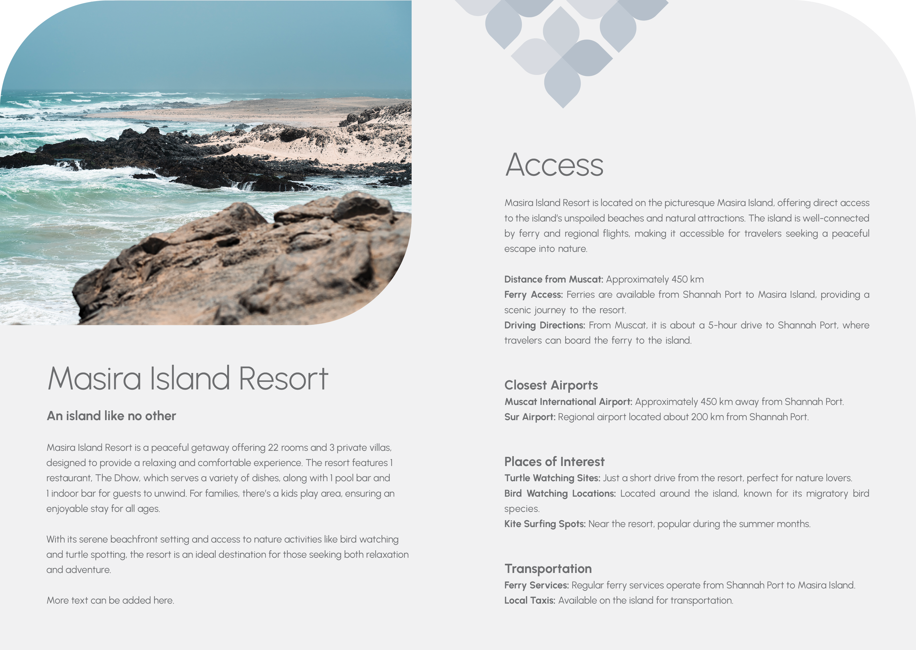
Masira Island Resort, a successful and long-standing property for the Dhiaffa Group, was heading into a major renovation. The challenge was that it had operated for years without a formal, consistent brand identity. We were tasked with creating a comprehensive brand manual from the ground up. The goal was to forge a strong, resonant identity that was deeply rooted in the island's unique character, Omani culture, and the profile of its loyal guests, giving the renovation a clear vision to build upon.
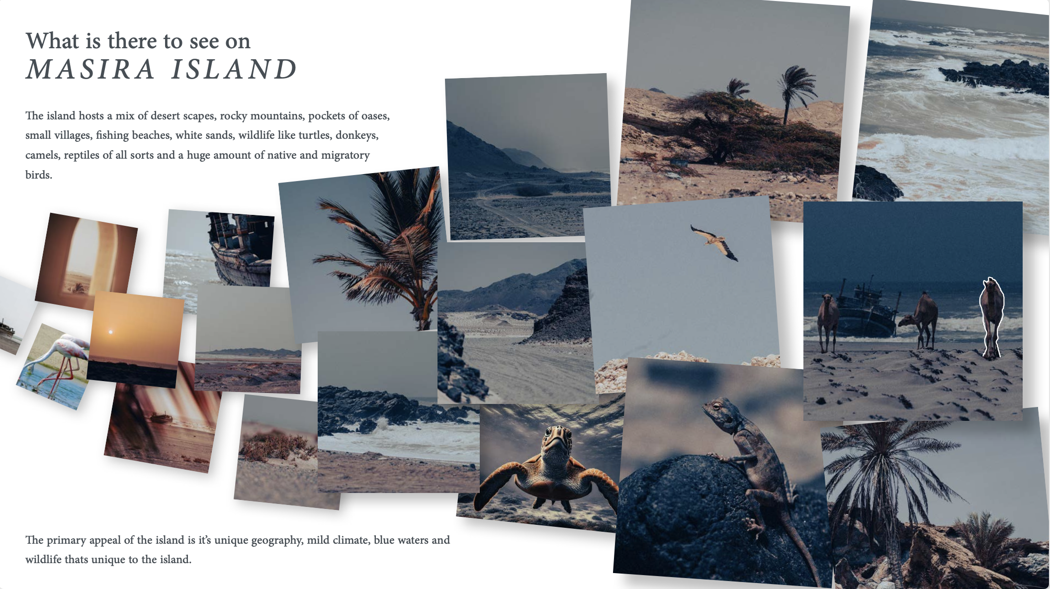
Let’s be honest, most resort branding is a sea of clichés. Pick a shade of blue, a sandy beige, find a nice script font, add a palm tree or a wave icon, and call it a day. The result is a brand that could be for anywhere, and therefore, is really for nowhere. It lacks a soul. We don't do that. We believe a brand shouldn't be imposed on a place; it should be discovered within it. Our process began not in a design studio, but on Masira Island itself. We walked the property, explored the coastline, and conducted a deep-dive survey into the island’s unique ecology, its rich history, and the specific local culture. We talked to people, we looked at the rocks, we watched the fishing boats come in. We needed to understand what made Masira Masira before we could even think about a logo. This immersive research allowed us to build the brand from an authentic foundation. Armed with genuine insight, we analyzed the competition, created mood boards drawn from real local textures, and developed an identity that feels like it grew organically from the island soil. The final brand is something that can’t be replicated because it’s not based on a trend, but on the truth of its location.

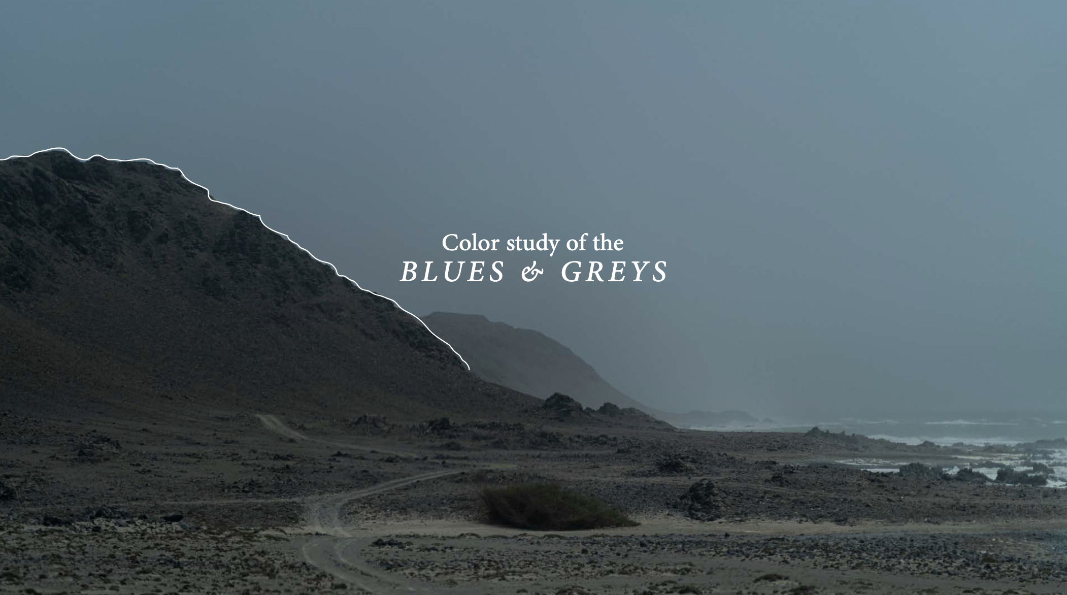
A Palette Pulled from the Land Itself What does this mean? It means instead of starting with a color wheel, we started with a camera and an open mind. We conducted a thorough color study of the island, documenting the exact hues found in its environment. This wasn't about finding the brightest blue of the sea, but about capturing the muted, earthy tones of the ancient rock formations, the specific greens of the sparse coastal vegetation, and the deep browns of the traditional fishing dhows. The result is a sophisticated and entirely unique color palette that tells the story of the island. It ensures every piece of collateral, from a menu to a billboard, is infused with the authentic spirit of Masira.
The grand finale The final deliverable was more than just a brand manual. It was a complete toolkit for the resort's future, containing new logos, a defined typography system, a photography and videography guide, and a full suite of design templates for all digital and collateral needs. It gave the Masira Island Resort team everything required to express their unique identity with clarity and confidence.